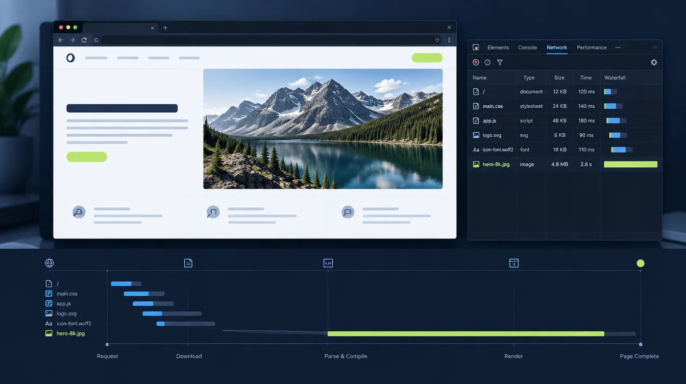
Images are often among the heaviest resources on a modern webpage. The imbalance is easy to create by accident. Someone uploads a photo straight off a camera, the CMS displays it at 600 pixels wide, and the page looks fine on the office network. The original file can still be several megabytes, and visitors may still download far more image data than the layout actually needs.
Large images slow down a website in several distinct ways, and the fixes differ depending on which kind of “large” is hurting you. Before changing anything, it helps to separate the problem into its parts.
“Large” means three different things
The word gets used loosely, and the ambiguity causes people to apply the wrong fix.
Large in file size is the number of bytes transferred. A multi-megabyte image that is not already cached still puts a large payload on the network. This cost becomes more noticeable as available throughput falls or the delivery path becomes less favorable.
Large in pixel dimensions is the intrinsic width and height of the image. A 5000 × 3000 photo displayed in a 600-pixel-wide container can require much more transfer, decode, memory and scaling work than an appropriately sized derivative. Browsers may optimize some decoding paths, but CSS scaling does not make the original transfer bytes disappear.
Large in decoded memory is what the image occupies after the browser expands it from its compressed format. That cost is driven mainly by pixel dimensions and the decoded pixel representation rather than the compressed file size. A heavily compressed, very high-resolution image can therefore be relatively small on the wire and still be expensive to decode and hold in memory.
A file can be problematic in one of these dimensions and acceptable in the others. Compressing a JPEG more aggressively reduces transfer bytes but does not reduce its intrinsic pixel dimensions. Resizing the source to an appropriate rendered size—while allowing for high-density screens—often improves transfer size, decode cost and memory use together.
How image weight turns into a slow page
Bandwidth contention during the critical path
Network capacity and browser resource priority are finite. With HTTP/1.1, per-origin connection limits can also constrain parallel downloads; HTTP/2 and HTTP/3 reduce that connection bottleneck through multiplexing, but they do not eliminate bandwidth contention. Large or numerous images can still compete with resources needed to render the page, including stylesheets, fonts and scripts.
This is also why image problems can become more visible for distant visitors. Bandwidth, latency and server processing time are different variables, but a large payload still takes time to deliver. A heavy hero image may load acceptably for one visitor and much later for another even when the origin server responds at roughly the same speed.
Largest Contentful Paint
On many pages, the Largest Contentful Paint element is an image: a hero banner, a product photo or an article header. LCP records when the largest qualifying content element in the viewport is rendered, so the discovery, priority, transfer and rendering of a prominent image can strongly influence the metric.
A common pattern makes this worse than it needs to be. The hero image is discovered late because it is referenced by CSS or injected by JavaScript rather than being discoverable in the initial HTML. The file itself may be reasonable; the discovery delay can still postpone LCP.
Layout shift
If an image has no declared dimensions, aspect ratio or other reserved layout space, the browser may not know how much room to allocate before the file arrives. When the image is rendered, content below it can move. That contributes to Cumulative Layout Shift when the movement meets the CLS scoring rules.
Decode and rendering work
Decoding is not free. Very large images consume CPU time and memory while the browser expands and renders them. On constrained devices, several oversized images can increase memory pressure and make the page feel sluggish even after the network transfer has mostly finished.
Reading a speed test for image problems
A controlled browser test can tell you whether the page behaves like a heavy-asset page, even before you inspect individual image files. When you run the page through Latixo, look at several signals together rather than treating any single number as proof.
Page weight. Latixo reports the transferred page weight observed during the Chromium run. If the page is unexpectedly heavy, images are one of the first asset classes worth checking—but the total alone does not prove that images are responsible.
Request count. A high request count can amplify contention and connection overhead. It does not tell you which requests are images, but it helps distinguish a page with a few oversized assets from one that is loading a very large number of resources.
TTFB versus total load time. If TTFB is relatively quick but total load time remains much longer, the origin's initial response is probably not the whole problem. Transfer, resource discovery, client-side execution and rendering after the first byte all become candidates. Use this as a direction for investigation, not as proof of a specific image bottleneck.
Protocol and content type. The result shows the navigation protocol and the main document content type. These are useful context, but they do not replace per-resource inspection when you need to identify one specific image file.
Screenshot and loading replay. This is where image problems can become visible rather than purely numerical. The replay can show whether a large visual arrives late, whether the first viewport looks incomplete for too long, or whether visible elements move as media appears.
A second region. Run the same URL with the same Test Profile from another Browser Node. For example, compare your normal region with the confirmed Tokyo website speed test. If TTFB remains similar but the visible load or total transfer phase becomes much slower, that points toward downstream network or rendering costs rather than additional origin processing. A single run still represents one controlled lab measurement, not every real user in that region.
Latixo is useful for spotting the pattern and comparing like with like. To identify the exact image files responsible, follow up with the browser Network panel or another per-resource diagnostic tool. For details on how Latixo's controlled tests should be interpreted, see the measurement methodology.
Fixing the images
Serve the size you display
Resize source images to roughly the largest dimensions they will actually be displayed at, while accounting for high-density screens. This often removes a large amount of unnecessary transfer and decode work without a visible quality penalty when the derivative is sized correctly.
If your CMS generates derivative sizes, verify that the front end actually requests them. Templates sometimes continue to reference the original upload while smaller generated versions sit unused.
Use responsive images
srcset with a correct sizes attribute lets the browser choose an appropriate source for the viewport and expected rendered width. A phone should not routinely download an image sized for a wide desktop layout. If sizes does not describe the actual layout width, the browser can still choose a needlessly large candidate.
The <picture> element is useful when you need art direction, alternate crops or format-specific sources.
Choose the format deliberately
WebP and AVIF can provide better compression than older raster formats for many images. AVIF can be especially efficient at a given visual quality, but the best result depends on the source image, encoder and settings. Test quality and file size rather than assuming one format will always win.
For photographs, lossy compression at a sensible quality setting is usually appropriate. For logos, icons, diagrams and line art, prefer vector SVG where the artwork is genuinely vector-based, or use a suitable lossless raster format when necessary. Avoid choosing JPEG for graphics that depend on crisp edges or transparency.
Do not lazy-load the wrong images
loading="lazy" is useful for images that start outside the initial viewport. It should not be applied to the image that is likely to become the LCP element, because deferring that fetch can directly delay the metric.
For the main above-the-fold image, make it discoverable in the initial HTML. Use fetchpriority="high" when the image is genuinely important, and use preload only where early discovery requires it. Marking too many resources as high priority simply creates a new prioritization problem.
Reserve the space
Set correct width and height attributes, or otherwise establish the aspect ratio before the image loads. The browser can then reserve the layout box early and reduce image-related layout shifts.
Cache and distribute
Static image assets are good candidates for long-lived caching when their URLs are versioned or fingerprinted. A CDN can also reduce the delivery distance for cacheable assets. Neither caching nor a CDN replaces resizing and compression, but each can remove a different part of the cost.
Verify the change instead of assuming it
After an image optimization pass, re-test under the same conditions you used for the original measurement: the same region, the same Test Profile and more than one run. Synthetic measurements vary, so a small difference between two isolated runs may be normal variance rather than a real improvement.
Comparing a Mobile test against a Desktop test measures two different profiles. Comparing a new result from one city against an old result from another mixes a code change with a location change. Keep the test conditions matched when you want to measure the effect of an image optimization.
Check the screenshot and loading replay again rather than looking only at the numbers. Aggressive compression can reduce transfer cost while visibly damaging product photography, diagrams or text rendered inside images. Performance work is successful when the page becomes faster without degrading the content users came to see.
Test the change: run the page from a region your visitors actually use at Latixo, keep the Test Profile consistent, and compare page weight, request count, total load time, screenshot and loading replay before and after the image changes.